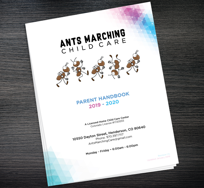
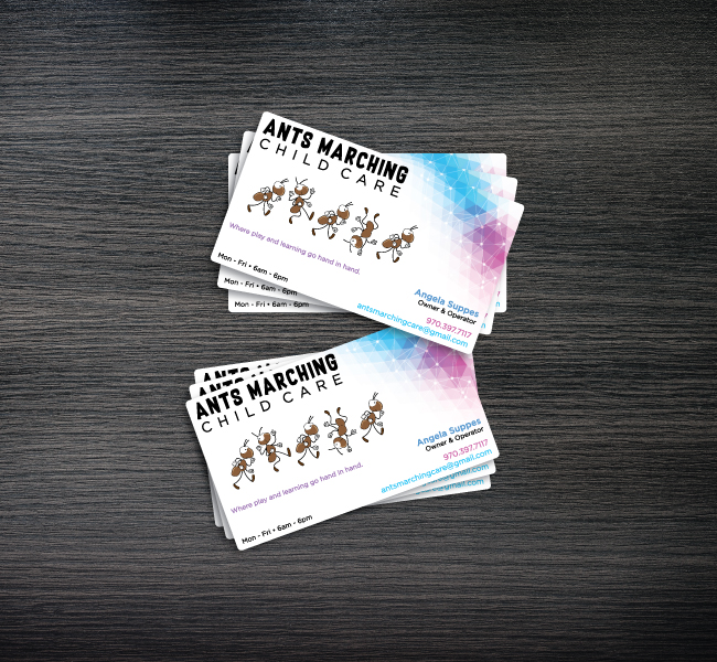
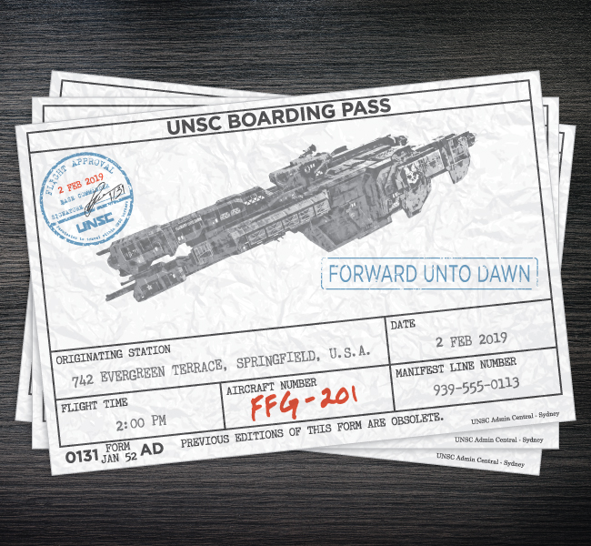
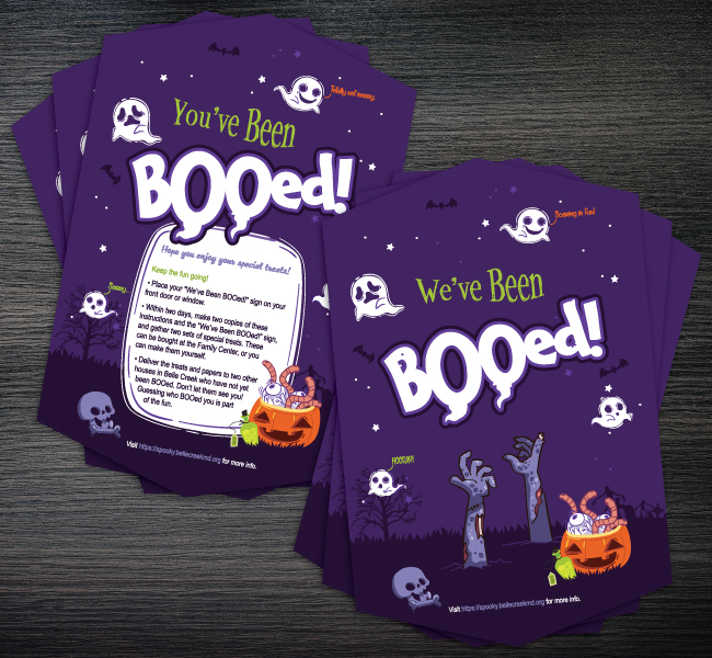
In late 2017 my wife decided to transition out of her full-time day job to running an in-home daycare facility. Branding work for the business started with a list of roughly 15 names that we both felt were not only playful and kid-centric, but conveyed the approach we wanted to take as an affordable in-home facility that operated in a similar manner to larger learning facilities. Out of the original list of names, we found we were most drawn to the phrase Ants Marching, eventually completing the business name as Ants Marching Child Care.
Once the business name had been established, I started work on the logo by laying out the text and working through a number of font choices before settling on the combination of Gotham and Supersonic Rocketship. Work then shifted to creating a simple, easily identifiable vector 'ant' that could be reproduced and easily modified to look like a line of marching ants. Initially both red and black color variants of the ants were tested, but my wife and I both felt that it didn't fit the cartoon feel of the ants, so I changed the color to a neutral brown.
The client approached me to create a logo and business cards for her after seeing the work I had done for Ants Marching Child Care. I was given free creative direction over the project, with only a small handful of requests for the finished design:
• The design should include a tree.
• The design should include animals.
• Gray and red colors should be used if possible.

While getting the colors in place, an idea popped into my head to use a script font for text component of the logo. I spent some time digging through various calligraphy and handwritten script fonts looking for one that caught my eye. After narrowing the selection down to 3 different script fonts to show the client, we eventually settled on Congrats Script because because of its playful cursive aesthetics.
I began the graphic component of the logo by sketching and creating different vector trees in Adobe Illustrator, working on placing the text below the branches of the tree. In total, I worked up roughly 5-10 versions using different trees and text placement, but found myself unhappy with each version, as I felt they didn't work well with the text component. Because of my frustration with how the logo was coming along, I confirmed with the client that I was ok to set things aside for a few days to clear my head on it, and work on another project. After some time away, I came back with a fresh set of eyes, and realized that the "realistic" looking trees I had been working with were ultimately causing my frustrations with the logo. After this realization, I moved towards more abstract, organic, shapes that showed the suggestion of a tree. After a couple of iterations, I eventually settled on the tree shape found in the final logo. After placing the text with the new tree shape, I knew I had found the combination that I was looking for, and set to adding the leaves to the tree. After completing the tree, I found there was a lot of unused white space within the logo, and used it as an excuse to add a bird perched in the tree. While I tried some other animal shapes below the tree, nothing seemed to look quite right in the space available, so I decided to add a swing hanging from lowest branch.
While my discussions about the text with the client had me using the script font for the entire text component, I felt I needed to contrast the script with a clean, minimal, sans serif font. I called an audible before my final presentation with the client, and without much hesitation, chose Eurofurence for its simplicity and unique letter shapes and angles. Once I got the kerning between the two typefaces how I liked it, I felt there was a bit of dead space on the outer edge of the logo and decided to fill the space with another animal, placing a squirrel on top of the sans serif typeface.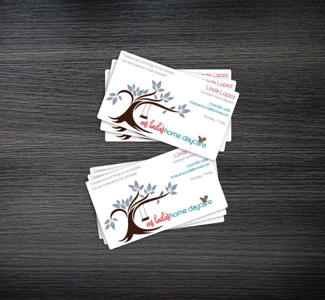

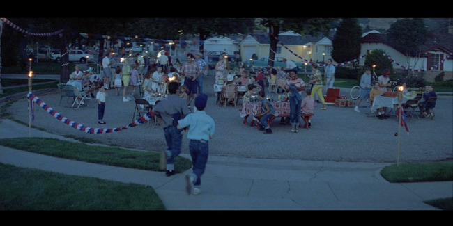
The requested turn around for this project was incredibly quick. On most invitation projects like this, I try to ask for a least a day to create the artwork and proof it at least once before sending the final copy to the client, but the request was to have this completed in less than 4 hours. When asking the client for information about the project, I was told that it should contain standard party contain information (address, time, RSVP information, etc), and should have a flamingo on it somewhere.
Since I didn't have much to go off of, and was trying to work everything within the deadline, I began looking for backgrounds on a clip art website. I came across a fairly standard, art-deco inspired, repeating circular pattern background, and felt like with the right color and cropping, it could feel very beach-like. I took out most of the art, leaving only a handful of the repeating lines, and used a couple of different opacities of a teal-blue color to make it look like water. I created a fairly flat looking flamingo in Adobe Illustrator, included this over top of the water pattern background, then added a few pink color variations to try and add the same level of depth that the water had. As there was still some dead space to fill, I ended up back on the clip art website looking for a palm tree that had a similar feel to the rest of the art.
For the text I tried to keep things similar to the art and use fonts that had a simple art-deco inspired feel to them. In the end, the whole thing felt a bit too monotonous, so I substituted in some script fonts, and a much heavier "eroded" font for the emphasized numbers (the toddler's age and date of the party). After making these substitutions, the proof was sent off to the client.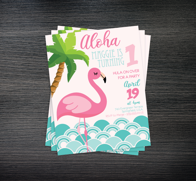
There's something amazing to me about the idea of designs that are meant to be destroyed. While the vast majority of the design world is propped up on creating designs that can stand the test of time, skateboard graphics are unique in that they're meant to be disposable flashes of brilliance.
The idea for this skateboard actually started back when I was in the beginning stages of my design degree, learning the fundamentals of Adobe Illustrator. We were working through a lesson on what our instructor called "Base Black" drawing, where every piece of art starts with a black base, and every compositing piece is built on top of it until you reach your completed piece of art. After going through the lesson, we were tasked with using what we had just learned to create a personal project. I'd been binge watching The Simpsons at the time, and had recently seen the episode In Marge We Trust, and the idea of using the base black process to recreate the Mr. Sparkle soap box from the episode seemed hilarious to me. While I don't recall what grade I got on the project all these years later, I do remember printing the recreated design out and taking it with me from job to job, always posting on the wall next my desk.
A few years and few job moves later, my Mr. Sparkle printout was looking worse for wear, and I needed a new one. As I still had access to the original Illustrator file, I opened it to see what was was a very low quality piece of art. As my work process and skills had advanced tremendously since I originally created it, I decided to recreate the artwork for a second time. While I was in the process of rebuilding it, I decided I wanted it to look less like the Mr. Sparkle soap box from the show, and more like the Mr. Sparkle commercial from the show. After completing the rebuild, I showed it to a friend and fellow skateboarder who casually mentioned that it would look good on the bottom of a deck. Taking him up on the idea, I spent a bit of time tweaking the design to best fit the format of a skateboard, and the Mr. Sparkle deck was born.
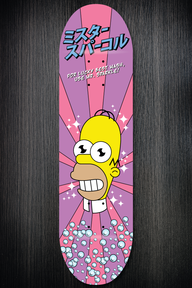
While I never expected much from this design, beyond my own personal amusement, I was immensely proud to find out that it had been featured as a DeviantArt Daily Deviation on September 21, 2005. Many people on the site loved it, and wanted to know where they could get one. Many others hated it and called for me to be banned from the site. Most of the skateboard designs on the site up until that time had been original creations and designs, not parody or fair-use designs. Ultimately it sparked conversations about the use of trademarked characters in skateboard graphics and how the site would handle such things. Many of those calling for me to be banned were from the fine art world, and hadn't really seen graphics in this manner before, even the skateboard industry had been selling parody decks for years by that time.
In the end, my little design did the same thing that all great works of art are supposed to do. Good or bad, it got people talking and started conversations. What more could I ask for?
After the success of my Mr. Sparkle skateboard on DeviantArt, I had a number of people message me through the site asking for commissioned pieces, or asking to collaborate with me. While working my way through all of the messages I received, the idea of a collaboration became more and more intriguing to me, as I loved the thought of trying to meld styles into one cohesive design. The problem was that none of the artists who'd reached out about collaborating seemed to work out. I did end up creating one or two commissioned designs, but honestly, most of the requests fell away just as quickly as I'd received them. Internet fame, such a fleeting mistress...
Still excited about the idea of a collaboration, I set out looking for another artist who's style I liked, and who's work I felt I could meld with or work my style into. Just a few short days after my artwork was featured, I came across another featured artist by the name of AugustC4, whose digital character paintings, based in the Jet Set Radio Future video game world, were garnering a lot of attention. I reached out to him almost immediate to discuss the idea of a collaboration, and while he was initial opposed to working together because of the differences in our styles, I eventually talked up my idea of a design based around the idea of old war propaganda posters enough that he decided to collaborate.
After a few discussions on how we wanted to approach things, he mentioned how he had been working on a number of different paintings for a new character series he was going to call the Red Doll Army. He had a few preliminary sketches done for the series, and after working though many of his ideas, he had tossed a couple of the sketches to the side, as he felt they didn't quite fit into his plans for where the series would go. He showed me a few of these sketches, and one immediately caught my eye. It was the very early outline of a woman in a flight attendant's uniform, facing forward and saluting. It felt perfect for the design idea of a war propaganda poster. He spent the next week or so finishing out the painting so that he could hand it off to me to complete the rest of the background and layout of the design.
While I waited for the finished character painting, I spent some time looking through old war propaganda posters, and was awestruck by the stark colors and and contrast of the Russian propaganda posters from both World Wars. After seeing the completed character painting, with its generally neutral brown tones, I knew I could use the opportunity to create a stark color design of my own. I initially attempted a drastic red and white combination to mimic what I had seen in the Russian war posters, but it never felt quite right with the character, so I went about refining the design, and would work on the colors later. By sheer accident, when I was using the Illustrator pen tool one afternoon to create some of the background vectors, I accidentally switched to the eyedropper tool and sampled a 5x5 square of the character's flesh tone. Since it had picked up some of the darker browns around it, it gave a deep orange color that immediately popped against being the character. From that point out, I knew I was going to be using varying orange colors within the same range to create depth, as well as white and black to create the contrast.
Once the design was complete, I showed it to August to get his thoughts. He was blown away by it, saying I had done it more justice than he thought I could when I was originally selling him on the collaboration. While we had originally planned to co-publish the piece on DeviantArt, he felt like my contributions had been greater to the project than his had been, and he gave me permission to publish the piece by myself, as long as I credited his contribution.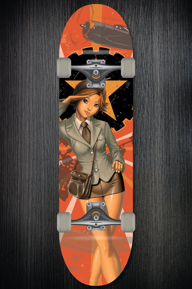
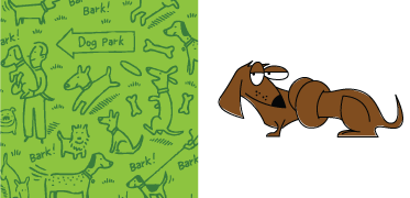
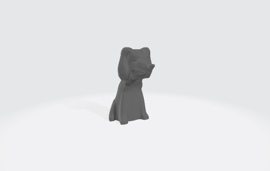
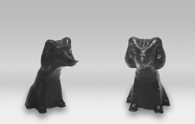
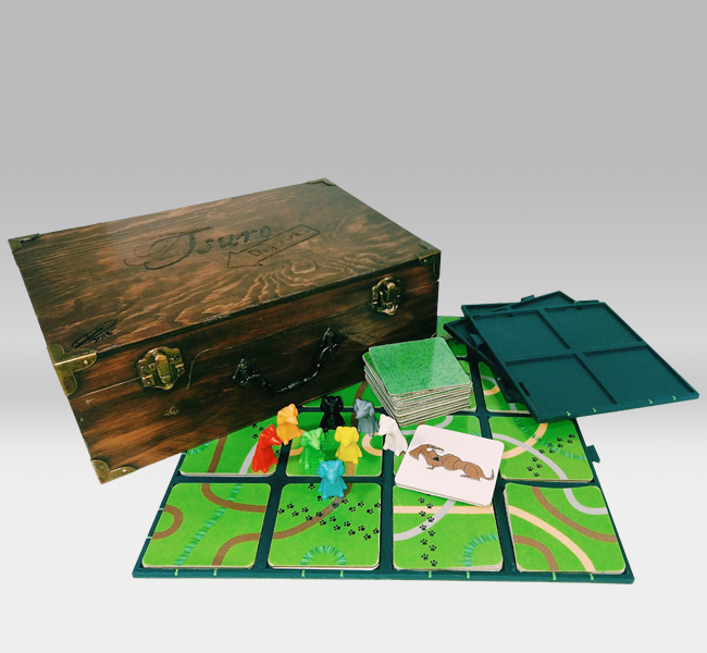
As a hobby gamer, I own my fair share of board games, and partly because of my involvement in the hobby, I've gotten involved in 3D printing. During a board game night in mid-2017, I was introduced to Tsuro: The Game of the Path. With it's simple mechanics and game play, and it's gorgeous design, it became one of my go-to games for introducing new players to the hobby. During one of these introductory sessions with a close family friend, she fell in love with the game, and it quickly moved to the top of her favorite games list. Since she travels for work frequently, our family and house have become a second home for her dachshund when she's away. Most dachshund owners deeply love the breed and collect various trinkets and items showing this. While dropping her dog off after one of her business trips, she asked when we would be able to play Tsuro again, mentioning that she really wished she had her own copy to play when friends and family were over.
Hearing her say this instantly flipped the switch in my brain. I could make a custom version of he game for her that utilized my design and art skills, my tinkering and crafting skills, and my 3D printer. As I was hoping to have the completed game ready for her on Christmas that year, I set to work almost immediately in my spare time, looking at the mass-produced version of the game, as well as custom versions other players had made. When working through my initial ideas for what I wanted it to look like, I drew my inspiration from the thing she loves most, her dachshund, since she's an incredibly unique and quirky dog, with an identity all her own.
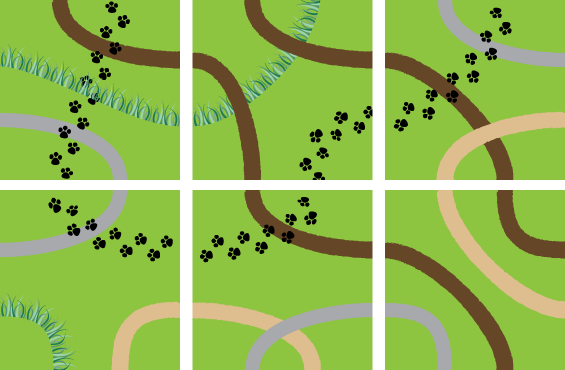
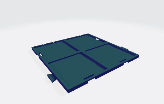
With dogs, and specifically a dog park, as the theme for the game, I set about creating the variations for all 36 tiles with things that can be found in a dog park. Each tile is built on a grass green base, while the paths on the tiles are made up of sidewalks, dirt, sand, paw prints, and overgrown grass edges.